-12

Update - the theme and layout is now live for everyone.

Thanks for your feedback in this process. If there's additional feedback, please feel free to add to the answers below.


As part of implementing the new unified themes across the network, we're gradually rolling out updated site themes for each site. As of today, we have enabled your updated site theme for testing.

If you can't see it right now, that's by design! We're hoping to get feedback from you before rolling it out to everyone permanently. If you'd like to review it, here's how:

How do I enable it?

Click here and check the "Beta test new themes" option. This will turn on the new theme for all sites that have one in testing, including this one. Here's more info on how to opt in. You can uncheck the box to revert to the older theme until the site is live for everyone (note, it will take a few minutes to go into effect).

What type of feedback do we need?

On this post: Bugs related to this site's design elements

Please help us look for issues/bugs related to the theme design and how we have mapped the old theme to the new. This needs to be done within the limits of the new unified theme.

On Meta Stack Exchange: General concerns about left nav or theming

If you have concerns or issues regarding the left nav or the overall approach we are taking to theming, then this Meta Stack Exchange post is the right place for feedback.

As you may notice, there are some unique design elements like voting arrows and tags that are being standardized in this process. Keeping these custom elements makes our ability to maintain the sites too complex and, while we're very sad to see them go, we're in a difficult position of needing to make the site designs work together so that we can continue to address feature requests and bugs that will make your Q&A experience better. This is addressed in a Meta Stack Exchange post if you want more detail.

What new themes?

If you're like, "What the heck are you talking about?", then you should read the Meta Stack Exchange post entitled Rollout of new network site themes (and maybe the posts it links to for the full background).

Thanks so much for your constructive feedback!

2
  • 7
    This is... terrible.
    – forest
    Commented Sep 21, 2018 at 1:28
  • 1
    @Catija Are you still monitoring this? There is no reaction to my issue and it is really bothering me.
    – user9482
    Commented Oct 23, 2018 at 7:20

6 Answers 6

16

General comments:

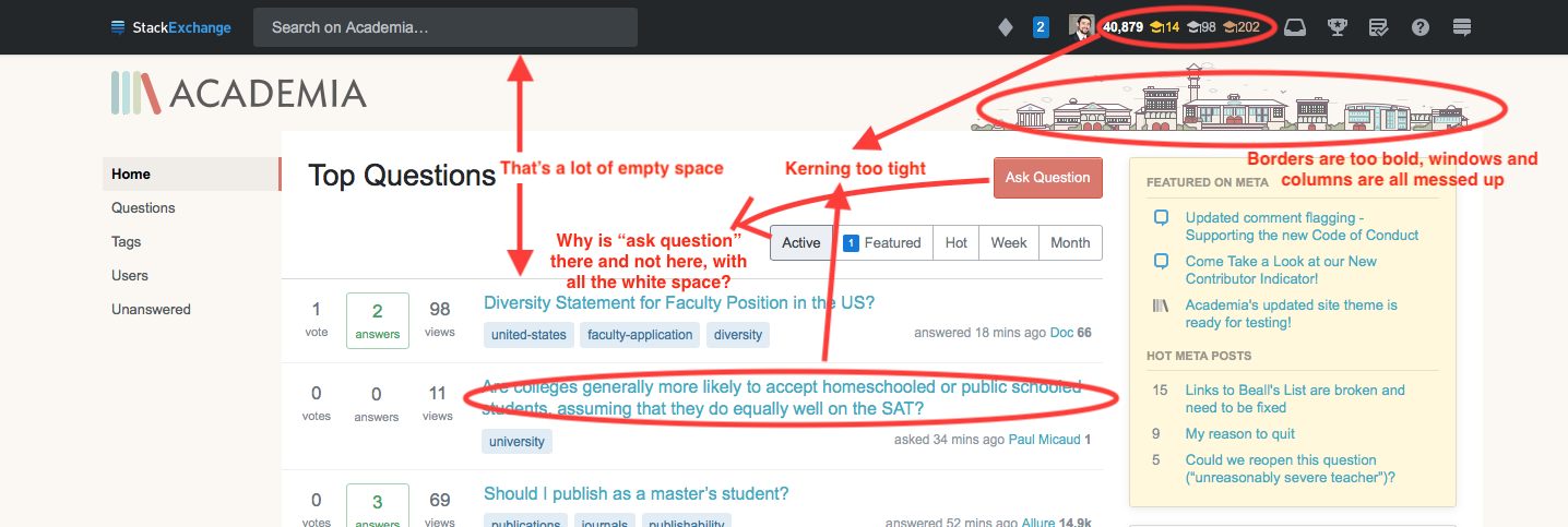
University image:

The line weight has been adjusted. When shrinking the image, the weights were too fine and made the image look fuzzy or undefined. We'll get a better weight for them.

Empty space:

It's important to remember that, while there's white space on that page, elements live in those empty spaces on other pages, like the Questions, Tags, or search results pages (links go to screenshots). Additionally, due to the responsive design, how much white space you see depends on your page width.

Ask Question button placement:

See the empty space images... The placement for this button needs to be easy-to-find and consistently in the same place. Right now, the only time this button isn't in that spot on a page it exists on is on question pages themselves, where it's been moved slightly to the right to make more space for question titles so they don't wrap so much.


comments on new page


Specifically on the kerning issue, it looks like the text is just bolded, which makes it look really bunched up. Comparing it to existing text, the existing is actually pretty bunched as well... may as well fix it if possible.

Old:

enter image description here enter image description here

New:

enter image description here ![enter image description here

16
  • 5
    I'm fairly sure "a lot of empty space" was the fundamental design theme. They've been consistently lambasted over the empty space and the left-nav panel-o-empty-space in particular (so much so that Catija was compelled to specifically mention a meta thread specifically about it). And yet they keep trucking forward. So my guess is that nothing's really going to be done about it. I hadn't really noticed the kerning thing yet, though. Good point. Commented Sep 2, 2018 at 4:27
  • 4
    I haven't seen a good explanation of what they want this space for, which presumably means it'll eventually be ads? Commented Sep 3, 2018 at 19:12
  • 1
    @NoahSnyder The placement of the elements is maintained on each page for ease of use. If you only look at the Home page, yes, it does look somewhat empty, but on search results or tag pages, there are more elements added and the space is utilized rather than empty. Keeping the elements in the same place makes them easier to find as the placement is predictable.
    – Catija StaffMod
    Commented Sep 4, 2018 at 1:46
  • 5
    stackoverflow.com/teams and stackoverflow.com/customers and stackoverflow.blog/2018/02/08/… might help in understanding why the left navigation was created in the first place. Less so why sites that are utterly unrelated to SO need to adopt this feature too.
    – Mari-Lou A
    Commented Sep 4, 2018 at 14:05
  • 4
    @Catija - Will we get any feedback as to whether these thoughts are incorporated into the final design? I've turned off the beta test for now as it really isn't as nice as the current design.
    – eykanal Mod
    Commented Sep 5, 2018 at 0:46
  • 2
    Yep. I or someone from the design team will be updating this thread with status tags as we discuss/implement changes. Hopefully starting tomorrow or Thursday.
    – Catija StaffMod
    Commented Sep 5, 2018 at 2:20
  • 1
    @Catija - Fantastic, thank you. Looking forwards to the evolving discussion. For what it's worth, if it would be possible for you to post high-res screenshots of the new pages that would be immensely helpful, as changing the settings is a pain in the buttocks.
    – eykanal Mod
    Commented Sep 5, 2018 at 3:08
  • 1
    We're fairly certain, @eykanal that what you're seeing with the kerning is due to a setting that's turned on on your computer. It looks like you're on a Mac. In preferences, on the General tab, at the very bottom there's an option for "Use LCD font smoothing when available". Coupled with certain monitors, this can give that "bold" appearance you're talking about. If you disable it and restart your browser, it should go away. That said, I'm not sure why you're seeing it on the new version and not the older one.
    – Catija StaffMod
    Commented Sep 6, 2018 at 2:01
  • 1
    @Catija - I'll try to test this tomorrow on a PC, but this was the same browser with the beta on and off. Not sure that checks out. I'll update.
    – eykanal Mod
    Commented Sep 6, 2018 at 2:21
  • 3
    @Catija Could you please avoid that style where you answer to our observations using blockquotes on top of the answer? First of all, it abuses quotes, then it's basically top-posting, and then it is difficult to figure out who the actual author of that text is and who it is directed to. It seems a terribly bad choice to me to use this method to discuss suggestions for improvements. Commented Sep 6, 2018 at 13:04
  • 1
    @FedericoPoloni I have no other option and it directly is an official response. This is the standard way we've been responding to this across the network and we've never had a complaint about it that I'm aware of until yours just now. Comments are often invisible and useless. If there were only one issue in each post, I could change it but when there are multiple issues, I have no choice... and I'm not going to use one style for each.
    – Catija StaffMod
    Commented Sep 6, 2018 at 13:05
  • 3
    @Catija I have no other option what do you mean? You clearly do have other options. Answering at the bottom or in a comment, for instance. Commented Sep 6, 2018 at 13:07
  • 2
    we've never had a complaint about it that I'm aware of until yours just now Actually, there has been a thread here on meta.academia about abusing blockquotes to add emphasis. Commented Sep 6, 2018 at 13:11
  • 3
    I'm 100% aware of y'all's policy here and the network's policy on quotes: meta.stackexchange.com/a/306037/284336
    – Catija StaffMod
    Commented Sep 6, 2018 at 13:15
  • 5
    @Catija maybe leaving your username underneath the block quotes would avoid possible confusion. We're all accustomed to using block quotes to actually "quote" somebody or a piece of text, and if an answer already contains block quotes it's easy to miss new ones added by a Community Mod. The mod specific tags help to differentiate but maybe a different shade or colour could be reserved for mods/dev team announcements/comments/agreements etc.?
    – Mari-Lou A
    Commented Sep 7, 2018 at 7:47
12

These are now blue instead of pink.

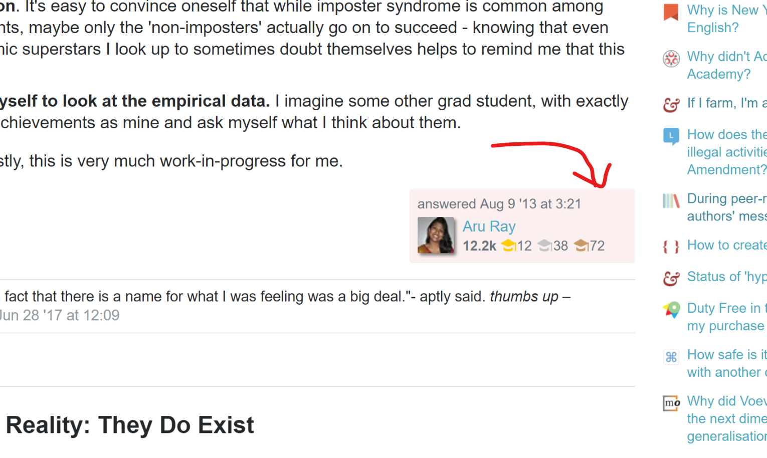
What's with the pink OP highlighting?

(from this answer.)

On the plus side, the jarringness of the pink has brought my attention that the OP signature gets highlighted in question and answer bylines just like it is in comments, even in the old styling, so there's that.

But why is it such an awful shade of pink? Why is it the same pink as deleted posts? (OK, it's not quite the same colour, but it's close enough that they register as the same colour if you don't have them in direct contrast.)

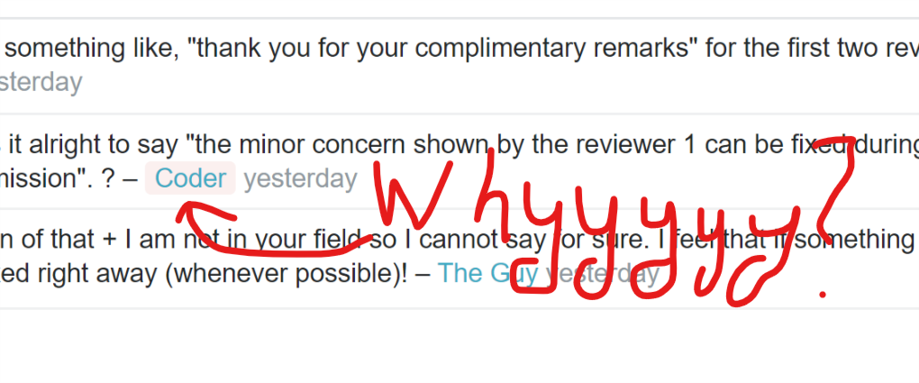
And to make things worse, the same awful transformation has attacked the comment highlighting:

Pretty please, choose a more neutral colour for this notation :-).

8
  • 3
    Heh, when I first thought that I thought there was a new feature that showed that this user was deleted.
    – forest
    Commented Sep 3, 2018 at 12:58
  • 5
    @forest That's precisely the problem. Light red has a long history as a functional design marker on this platform (and exclusively so, moreover), and using it for something else waters down that significance (which is bad) and carries over those connotations to places where it is harmful (also bad). (Not berating you, btw - just spelling it out explicitly because it does need to be said.)
    – E.P.
    Commented Sep 4, 2018 at 10:08
  • 2
    Oh I fully agree. It's an obnoxiously confusing color.
    – forest
    Commented Sep 4, 2018 at 10:42
  • 2
    So, the way we determine these colors is by looking at the primary button color (in this case a dark red/pink) and lightening it. We can get rid of the pink but we'll also need to change the button colors for the Ask Question button and the other buttons around the site.
    – Catija StaffMod
    Commented Sep 5, 2018 at 20:08
  • 2
    @Catija Ah. That is an extremely unfortunate coincidence. I also take it that the button color is derived from the overall color scheme and in particular the tilted book in the logo? That does significantly narrow down the options, indeed, and it balances a nice and active color from the button vs an anti-functional design. Maybe change the button color to the grayish blue of the leftmost book? Or uncouple the button color from the logo scheme to a more neutral bookish reddish brown that doesn't look pink when lightened? (Is that uncoupling possible? Or are other things also hooked on that?)
    – E.P.
    Commented Sep 5, 2018 at 20:23
  • 1
    We'll see in the next update, I think... this has been "fixed" on the designer's end but I think it's waiting for someone to build to the site. I'm not sure which option he went with.
    – Catija StaffMod
    Commented Sep 6, 2018 at 2:03
  • 1
    Apparently they're blue now and the ask question button is still red... There you go!
    – Catija StaffMod
    Commented Sep 6, 2018 at 16:29
  • 1
    @Catija Thanks for the follow-up - it's great to see this.
    – E.P.
    Commented Sep 6, 2018 at 16:35
7

The line weights have been adjusted. When shrinking the image, the weights were too fine and made the image look fuzzy or undefined. We'll get a better weight for them. Clock face also has hands now!

The line strength for the buildings in the top right is too thick given the shrunk buildings. I acknowledge that it has to be at least one pixel, so my best suggestion is to remove or shrink the clock tower and clouds and increase the size of the buildings, as long as they have enough space at the top without looking crammed.

Also, in case you keep the clock tower, the face of the clock could be made more recognisable. You still have space for more than three pixels.

1
3

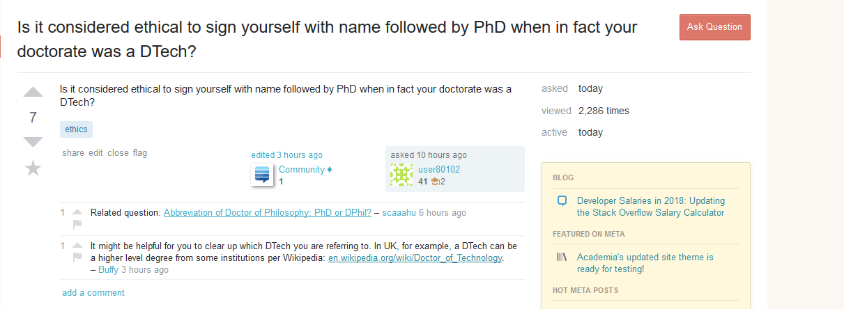
This header doesn't exactly look great:

A bad title

It seems like the title should only go as far as the divider between the question and the right bar. Right now, it doesn't seem like it's part of the same element. And, with two-line titles like this one, there's a lot of awkward empty space.

3
  • 1
    This is a general issue with the new unified theme that is not specific to this site (example).
    – Wrzlprmft Mod
    Commented Sep 7, 2018 at 21:24
  • 1
    Oh okay, this was just the first place I noticed it. Commented Sep 7, 2018 at 21:48
  • 1
    As @Wrzlprmft says, this is the case. We're actually looking into this anyways because it means the Ask question button isn't consistently placed, too. Part of the issue is that long titles wrap a lot on smaller screens, so we wanted to widen the potential title width beyond the center section alone... this may not be the best solution and some fixes will be addressed when we optimize the layout for mobile, which it currently isn't.
    – Catija StaffMod
    Commented Sep 7, 2018 at 23:55
2

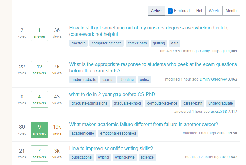
Accessibility issue: I'm wearing glasses but have generally very good eye-sight with them. However, since recently I'm finding it hard to read the titles in the list of questions on the front page. I can only imagine how bad it is for people with poor eye-sight. The blue seems to be an even lighter color than on the Stack Overflow front page.

You should change this to something with more contrast to the background as soon as possible.

Edit:

I've realized it looks different on different systems. Here is a screenshot of what I see with Firefox 61 on Windows 10.

screenshot

1

There isn't enough contrast between "open" questions and questions with an accepted answer on the landing page. The box around the answer is nice, but some shading would make it clearer—and break up the monotony.

2
  • Can you show me what you see and what you're asking for? The questions with accepted answers have the answer box in bright green, so it's pretty clear in my view.
    – Catija StaffMod
    Commented Sep 19, 2018 at 12:11
  • I have to use night shift pretty intensively (even during the day), so the green of the box doesn't show nearly as much contrast with the black but will look the same if I try to screen grab it. So I get the box without nearly as much contrast.
    – aeismail Mod
    Commented Sep 19, 2018 at 23:20

You must log in to answer this question.

Not the answer you're looking for? Browse other questions tagged .