Link
edited tags
Link
Suresh
  • 51.1k
  • 12
  • 15
added 461 characters in body; edited title
Source Link

UPDATED (APRIL 14): Design for Academia.se

I’m Stéphane, senior product designer at Stack Exchange. First, I wanted to congratulate you because this site is now starting the process of moving out of beta to become a fully-graduated site! Well done!

Graduation and Your Site Design

Graduation comes with a few perks. I have already begun work on your site's design, which will give you your own unique theme that reflects your topic and culture. This will help brand your site as unique, even while you share common elements with other sites that show you are part of a bigger Stack Exchange family.

Once the design goes up, you will receive a link in the footer of other sites in the network, along with the ability to migrate content to and from other sites — and the notoriety of a public launch that says, "Congratulations, you finally made it!"

Design Concept

For our academia.se community's site design and branding, I wanted to have a "campus life" feel. I think it's most effectively conveyed with a hand-drawn illustration style. It has a personal and lively feel to it. I've gathered some artwork I found online for setting up a mood board.

Mood Board
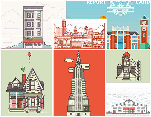
mood

Color scheme

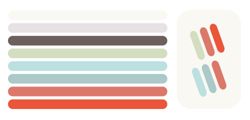
color scheme

This color scheme reminds me of autumn. It's warm and inviting. Fall is also when a new academic year starts. All the pastel colors bring calm and harmony and they are lighted up by the green and the red. This way we can balance our design from calmness to more contrasted and focused area.

Logo

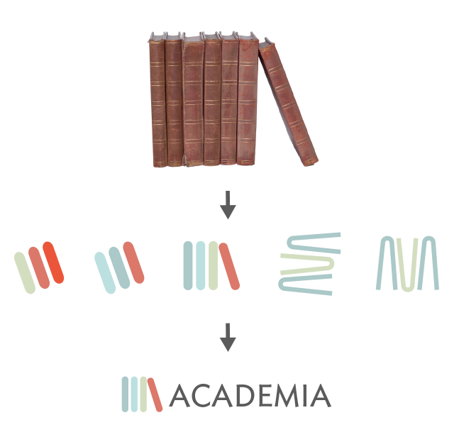
All the knowledge has always been passed on by books through the years, they are the origins of teaching. The idea was to evoke some books in a bookcase but in a non figurative way.
Logo

I believe this modernized logo works in other mediums to promote our site as well.

Swag

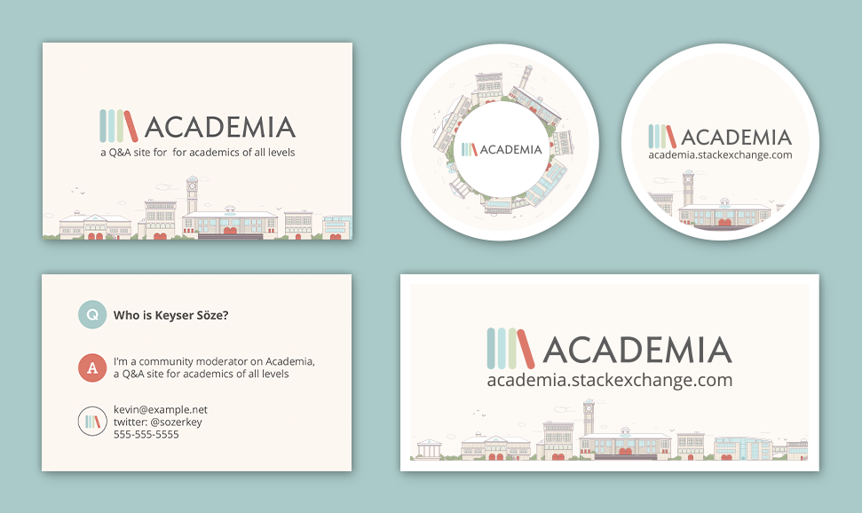
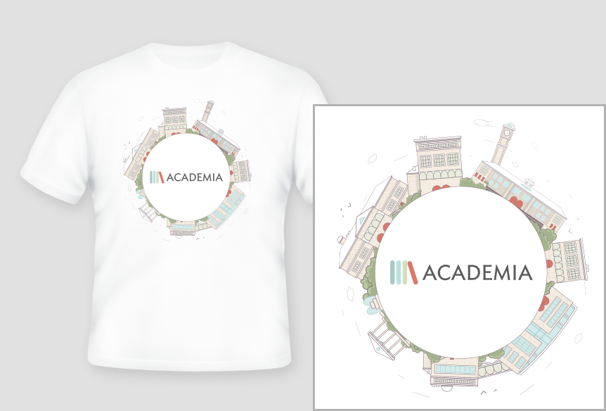
Business cards / stickers / t-shirt

Click on the image to view it at full size.

swag t shirt

Overall site design

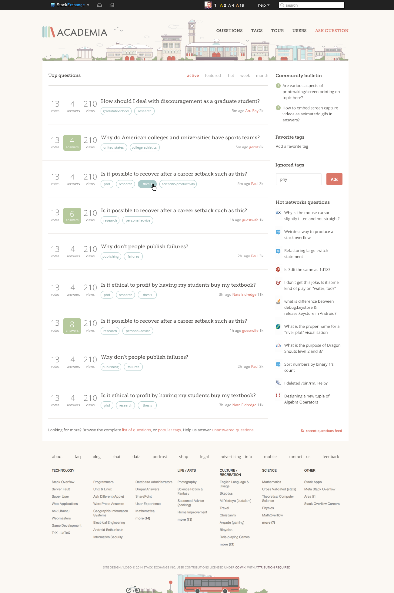
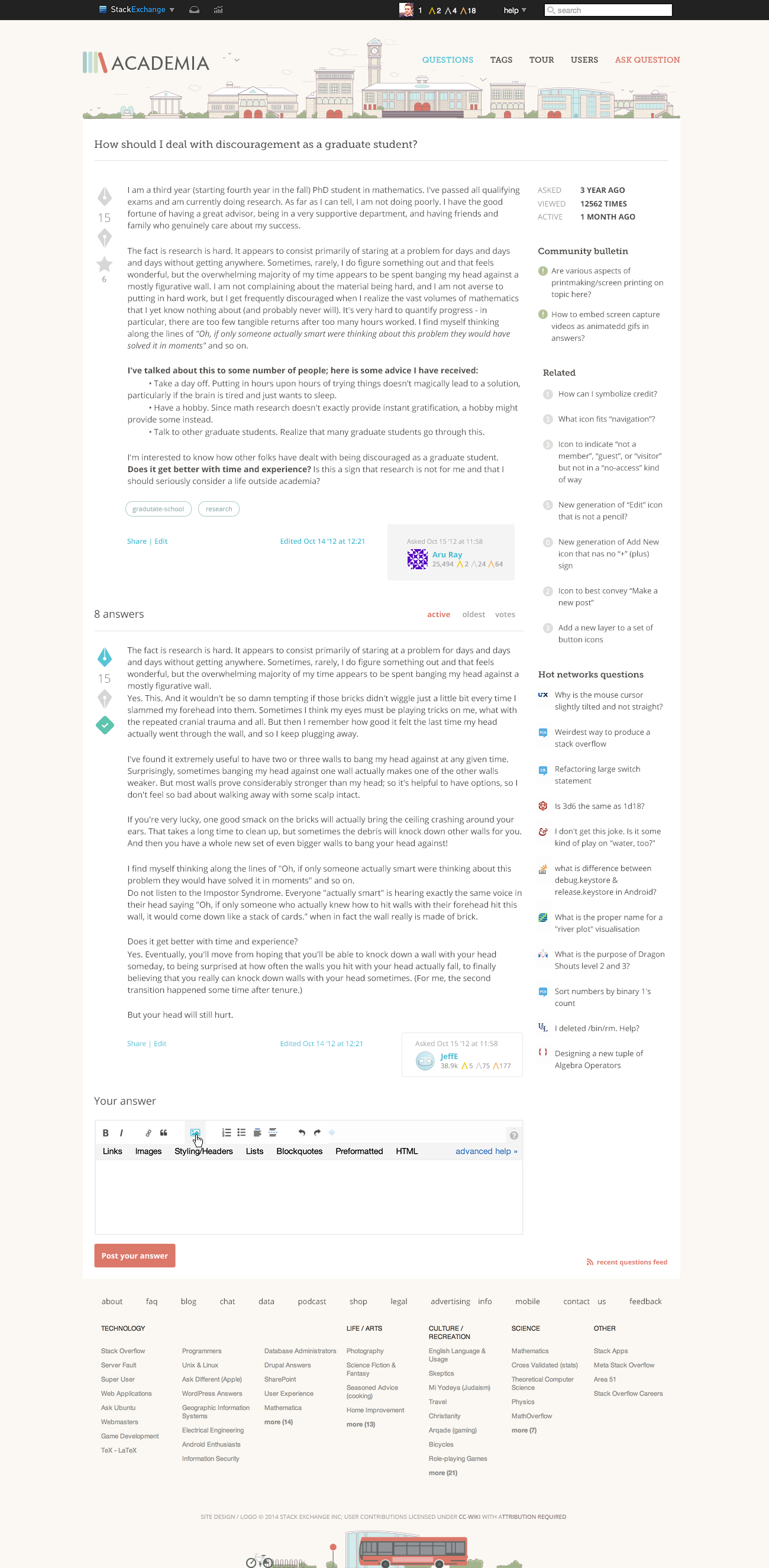
Click on the images to view them at full size.

home

question

Main illustration

Click on the image to view it at full size.

illustration

I believe the design captures the mood I was going for. I'd love to hear your feedback. If there are no major design changes, we're hoping to launch the site soon. Thank you for being an awesome community!


Edit:

Thank you for your valued feedback! I've changed the badges based on your answers and comments. They now are mortarboards.

Click on the image to view it at full size. Badges

Regarding the question list, I will tweak some vertical space and font size during the coding to have the most perfect rendering across browsers.

Design for Academia.se

I’m Stéphane, senior product designer at Stack Exchange. First, I wanted to congratulate you because this site is now starting the process of moving out of beta to become a fully-graduated site! Well done!

Graduation and Your Site Design

Graduation comes with a few perks. I have already begun work on your site's design, which will give you your own unique theme that reflects your topic and culture. This will help brand your site as unique, even while you share common elements with other sites that show you are part of a bigger Stack Exchange family.

Once the design goes up, you will receive a link in the footer of other sites in the network, along with the ability to migrate content to and from other sites — and the notoriety of a public launch that says, "Congratulations, you finally made it!"

Design Concept

For our academia.se community's site design and branding, I wanted to have a "campus life" feel. I think it's most effectively conveyed with a hand-drawn illustration style. It has a personal and lively feel to it. I've gathered some artwork I found online for setting up a mood board.

Mood Board

mood

Color scheme

color scheme

This color scheme reminds me of autumn. It's warm and inviting. Fall is also when a new academic year starts. All the pastel colors bring calm and harmony and they are lighted up by the green and the red. This way we can balance our design from calmness to more contrasted and focused area.

Logo

All the knowledge has always been passed on by books through the years, they are the origins of teaching. The idea was to evoke some books in a bookcase but in a non figurative way.

Logo

I believe this modernized logo works in other mediums to promote our site as well.

Swag

Business cards / stickers / t-shirt

Click on the image to view it at full size.

swag t shirt

Overall site design

Click on the images to view them at full size.

home

question

Main illustration

Click on the image to view it at full size.

illustration

I believe the design captures the mood I was going for. I'd love to hear your feedback. If there are no major design changes, we're hoping to launch the site soon. Thank you for being an awesome community!

UPDATED (APRIL 14): Design for Academia.se

I’m Stéphane, senior product designer at Stack Exchange. First, I wanted to congratulate you because this site is now starting the process of moving out of beta to become a fully-graduated site! Well done!

Graduation and Your Site Design

Graduation comes with a few perks. I have already begun work on your site's design, which will give you your own unique theme that reflects your topic and culture. This will help brand your site as unique, even while you share common elements with other sites that show you are part of a bigger Stack Exchange family.

Once the design goes up, you will receive a link in the footer of other sites in the network, along with the ability to migrate content to and from other sites — and the notoriety of a public launch that says, "Congratulations, you finally made it!"

Design Concept

For our academia.se community's site design and branding, I wanted to have a "campus life" feel. I think it's most effectively conveyed with a hand-drawn illustration style. It has a personal and lively feel to it. I've gathered some artwork I found online for setting up a mood board.

Mood Board

mood

Color scheme

color scheme

This color scheme reminds me of autumn. It's warm and inviting. Fall is also when a new academic year starts. All the pastel colors bring calm and harmony and they are lighted up by the green and the red. This way we can balance our design from calmness to more contrasted and focused area.

Logo

All the knowledge has always been passed on by books through the years, they are the origins of teaching. The idea was to evoke some books in a bookcase but in a non figurative way.

Logo

I believe this modernized logo works in other mediums to promote our site as well.

Swag

Business cards / stickers / t-shirt

Click on the image to view it at full size.

swag t shirt

Overall site design

Click on the images to view them at full size.

home

question

Main illustration

Click on the image to view it at full size.

illustration

I believe the design captures the mood I was going for. I'd love to hear your feedback. If there are no major design changes, we're hoping to launch the site soon. Thank you for being an awesome community!


Edit:

Thank you for your valued feedback! I've changed the badges based on your answers and comments. They now are mortarboards.

Click on the image to view it at full size. Badges

Regarding the question list, I will tweak some vertical space and font size during the coding to have the most perfect rendering across browsers.
Tweeted twitter.com/#!/StackAcademia/status/454624742428131328
added 3 characters in body
Source Link
aeismail Mod
  • 174.9k
  • 25
  • 46
Loading
Source Link
Loading